 +1-855-943-0404 (Toll Free)
  +44-203-514-1803
Tag Archives: mobile applications
The Leading Mobile App Design Trends for 2017Tag Archives:
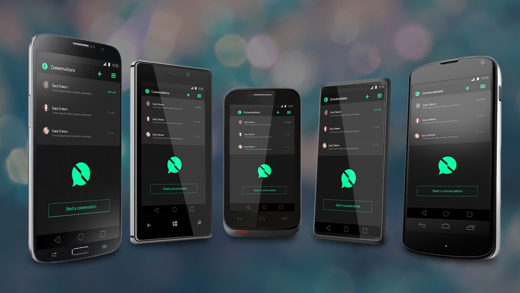
Posted by ThinSquare ON Monday , 19 Dec 2016 5 Comments
The tech landscape has changed much from it was a few years ago and the smartphones have gone much beyond than just making calls and sending texts. Now, they have become the mean to meet our daily life requirements through the various apps that are developed for these devices. Whether it is education, health, profession, shopping, news or any other topic, you will easily get an app for that.
However, as the use of the mobile apps is highly increasing, the innovation in their development is taking a centre stage. New trends come from time to time and bring advancements to the mobile app technology. Though it is hard to make predictions about this vast landscape, but here we are jotting down some mobile app design trends that will be on the top in 2017.
Better UI for gestures
Gestures include the touch mechanics and the touch activity and the mobile apps get a super power in the terms of usability, UX and retention with the addition of new and interesting gestures. The success of the mobile apps highly depends on the gestures implemented for the better user experience. And in 2017, the experts are going to add some new gestures that will ensure good user experience by making the app interactive, content focused and by making the app response fast.
Tamagotchi gestures are the latest ones that are going to be implemented in the design by UX professionals, in 2017. They will focus on bringing the required human touch in the app.
Multi-app split screen on Android
The convenience of the split screen is beyond amazing; it lets you do two tasks simultaneously, on your screen. It not only saves the time but also eliminates the trouble of switching between the opened windows. For an instance, you can be tweeting and browsing the web for some other purpose at the same time.
As the companies are offering the mobile devices with the split-screen capabilities and Google is also going to introduce the feature on its devices, the developers and designers are required to focus on producing this feature for Android.
Material design
Talking about the design trend that is there to stay forever, it is the material design. It has no more remained a Flat one; the use of various techniques like shadows, gradients and other 3D effects has led to the improvements in the UX and has excited the people. The trend of the material design has come into existence with the intent of making user engagement easier on the different mobile platforms.
Wearables are influencing the mobile app technology
The wearable gadget have taken the concept of “mobile” to the new dimensions. The wearable market has experienced an increase of 18.4% in 2016, from the previous year and this, the increase is further going to rise in 2017. It is not only about the smaller screens, but the ways of using the various apps and the scenarios in which you use the wearable mobile technology are also different. This depicts the need of necessary changes in the user experience.
And this raised increase will let the designers and developers race for creating the intuitive, user-focused and user-friendly apps for these mobile devices.
All these trends will focus on enhancing the user experience and bridging the gap between the virtual and reality. These trends are not only going to impact the mobile app design for 2017 but will also affect the changes that will come in the technology in the future.
Tag Archives: mobile applications
How To Develop Affluent Blueprint Of Your Mobile E-commerce Website?Tag Archives:

Posted by ThinSquare ON Saturday , 4 Jul 2015 No Comments
Nowadays, whenever you look around you will find people with their smartphones. With the increase in the sales of smartphones and other handheld devices, it has become essential to target the mobile audience or else you will be losing business. If you go by the latest stats, about ¼ of the population shop online. So if you plan to expand your online business, you can do the same by designing a mobile app for your e-commerce website.
Know The Audience
Before starting with the development process, it is important that you have good knowledge of your audience. You should have a clear idea about the customers you are building the website for. You need to put yourself in your potential customers’ mind and then understand their mood and intention.
Use of mobile phone
Nowadays, the mobile phone has emerged as a life-saving tool and thus people are using it while:
Shopping
Enjoying an evening out with friends
Watching TV
Eating a meal
Waiting for somebody
Getting bored or even in the bathroom
In each of the above stated situation, it is not necessary that the person is accessing your website to make a purchase. Now you may be thinking that how will this information help you? By knowing the number of customers that access your website during a specific period of time, you can design a website that can cater to their requirements.
Different types of mobile shoppers
According to Columbia Business School, there are 3 different types of mobile shoppers. So let’s know more about them.
1. The Comparer
This is the most common type of customers that you will meet in your brick and mortar store or online business. They may visit your online store just to make a comparison and end up buying the stuff from your brick and mortar shop. However, if they come across an online offer that is too hard to resist, they can jump in to grab the offer and make a purchase online.
2. The Deal Lovers
These are the type of people that loves bargain deals. When they are shopping from a mall, they will always look for online discount coupons and would love to save their money by buying the best items from the exclusive sales. They are different from the comparer as they will buy whenever they know that they are getting a special deal.
3. The Time Passers
These are the shoppers who just browse through different shopping apps and buy whatever they like. They are impulsive shoppers and do not wait for discounts or limited period offer on the stuff they want to buy. They may even subscribe to the news feed to know more about the latest addition in the online store.
Establish Success Parameters
After knowing your audience, it is vital to establish the success parameters. You need to set up goals to track and measure your success. So the SMART goals include:
S – The goals should be specific and significant.
M – You should be able to measure the meaningful conversions.
A – The set goals should be easily attainable, achievable, and should be action-oriented.
R – Set realistic, results-oriented, relevant, and rewarding goals.
T – How much time is required to achieve the results? Your goals should be time-based and trackable.
Choose A Responsive Website
If you are planning to target the mobile audience, you have the option to choose between a responsive website and mobile applications. However, choosing a responsive website is beneficial as it automatically adjusts to the screen on which it is being viewed. Nonetheless, whatever you choose, make sure that it suits your business requirements.
Create Wireframes
Once you have collected all the information, it is the right time to design the e-commerce website. Before selecting different colors and images, make sure that the structure of the mobile website is defined. In this manner, you can identify the potential pitfalls that the user may experience.
You can use wireframes as they are easy to modify and as a user, you can play around with different options. After getting an approval for the wireframes, they can be used as a blueprint for the designing stage.
The Website Designing Process
When we talk about the mobile e-commerce website, functionality and design plays an important role. While the website design reflects your brand, offering the best possible user experience is important to encourage them to shop from your website.
If you are thinking about the important factors that must be considered when designing the functionality and look of your e-commerce website, here’s the answer:
Design
The designing part features three different aspects:
Navigation
Typography
Photography
The website should be easy to navigate and the search function should be up to the mark. Moreover, as the mobile phone screens are smaller than the desktop screens, make sure that the content is easily readable. The visitors should be able to read the product description easily in order to know more about it. You should also use high-quality images to convince the customers into buying the products.
Functionality
The visitors coming to your website should get what they are expecting. Your website should allow social media sharing so that the online users can share the products with the friends and family. You can even offer the option of auto-fill order form to make it easy for the users to fill in their information. Most importantly, offer your customers a chance to make the payment through various channels so that they can easily pick up one to make the payments.
Give a fresh start to your e-commerce business and reinvent your services. You need to design your business website according to your customer’s requirements so that they are happy browsing it. Putting up an e-commerce website may seem to be a difficult task, however, it would be worth putting in all the efforts if you are able to convert your clients into potential leads. So plan your e-commerce website in such a manner that it offers an optimized experienced to your visitors.
Category
- Apps
- Content Marketing
- Conversion
- Design
- Development
- Digital Marketing
- eMarketing
- Social Media
- Video Marketing
SOCIAL Media

FIND US ON FACEBOOK
POPULAR
-
Secrets Revealed – Top 6 Tricks To Increase YouTube Views & Subscribers .
May 4, 2015 Views : 5924 -
The Leading Mobile App Design Trends for 2017
Dec 19, 2016 Views : 1576 -
Top 10 Essential Elements of Successful E-commerce Website
Jul 13, 2015 Views : 1651 -
Going To Hire A Web Development Company? Avoid These Mistakes..
Aug 1, 2016 Views : 1492 -
Top 15 Tricks To Optimize Shopify Store To Get Higher Ranking & Traffic
Jun 2, 2015 Views : 2560
 +1-855-943-0404
  Email us


